
rainbow sky
creations
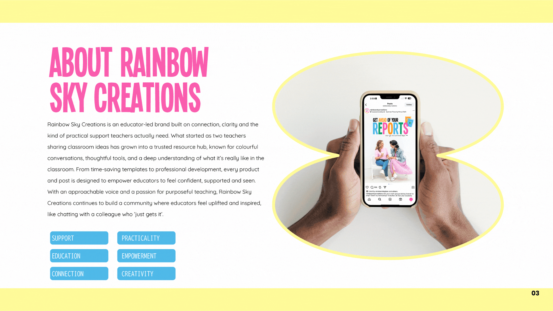
Ash and Alisha reached out to me at a pivotal moment. They were already established thought leaders in the "teacher-author" space, but as they prepared to launch a brand-new website, they realised their visuals hadn't quite kept pace with their growth.
What started as a request for a simple logo refresh quickly evolved into a much deeper conversation. They didn't just need a quick aesthetic update; they needed a visual identity that captured their "yin and yang" dynamic and their mission to bring joy back into the classroom. We moved beyond just "updating the logo" to building a cohesive, professional system that reflected the heart of two teachers who truly "get it."
the backstory
the logos
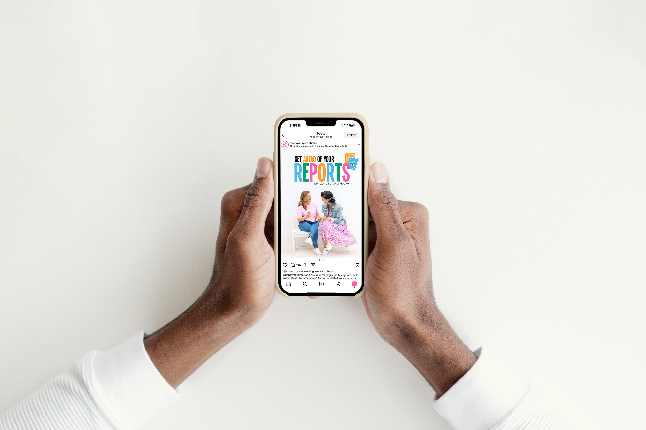
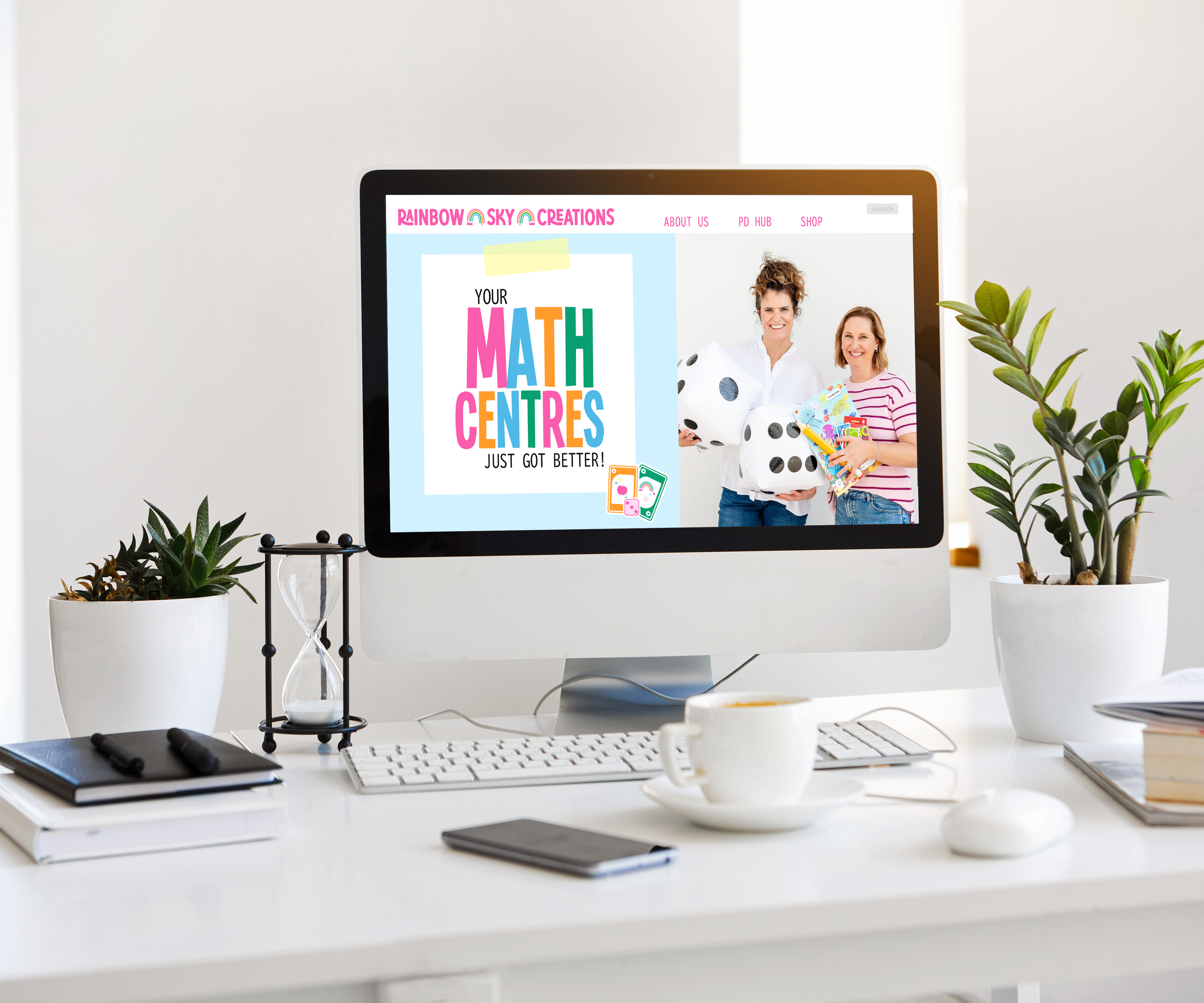
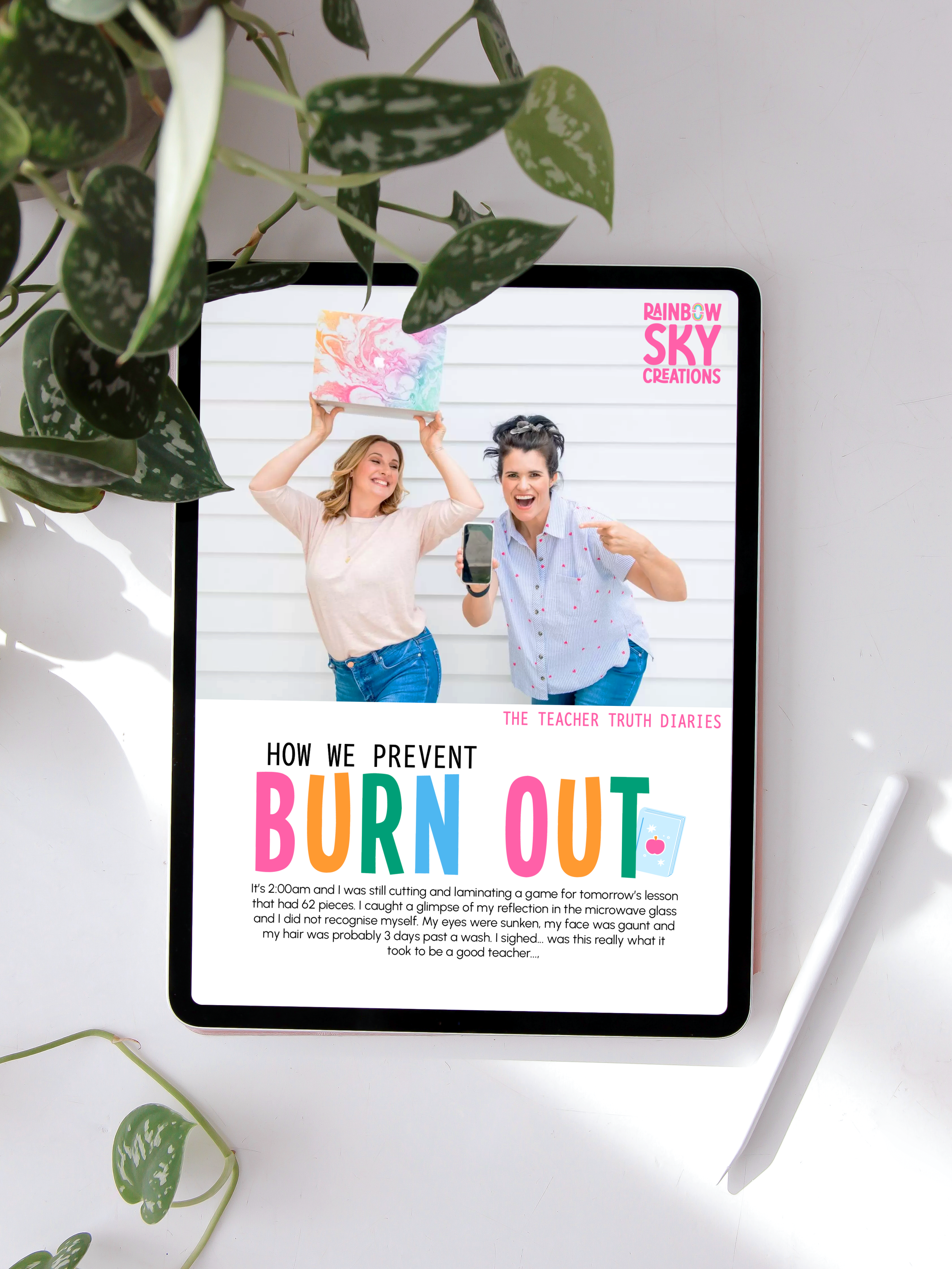
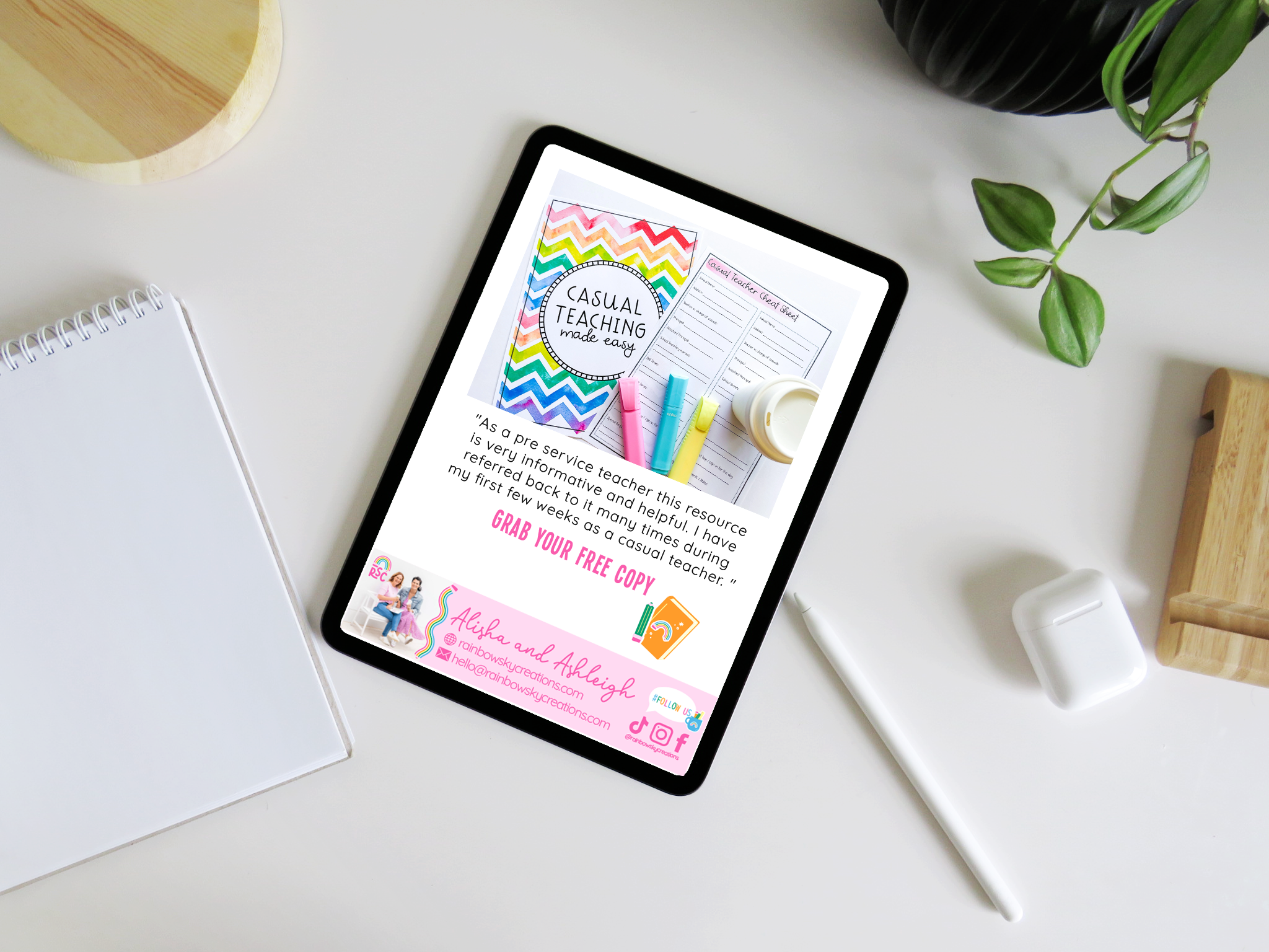
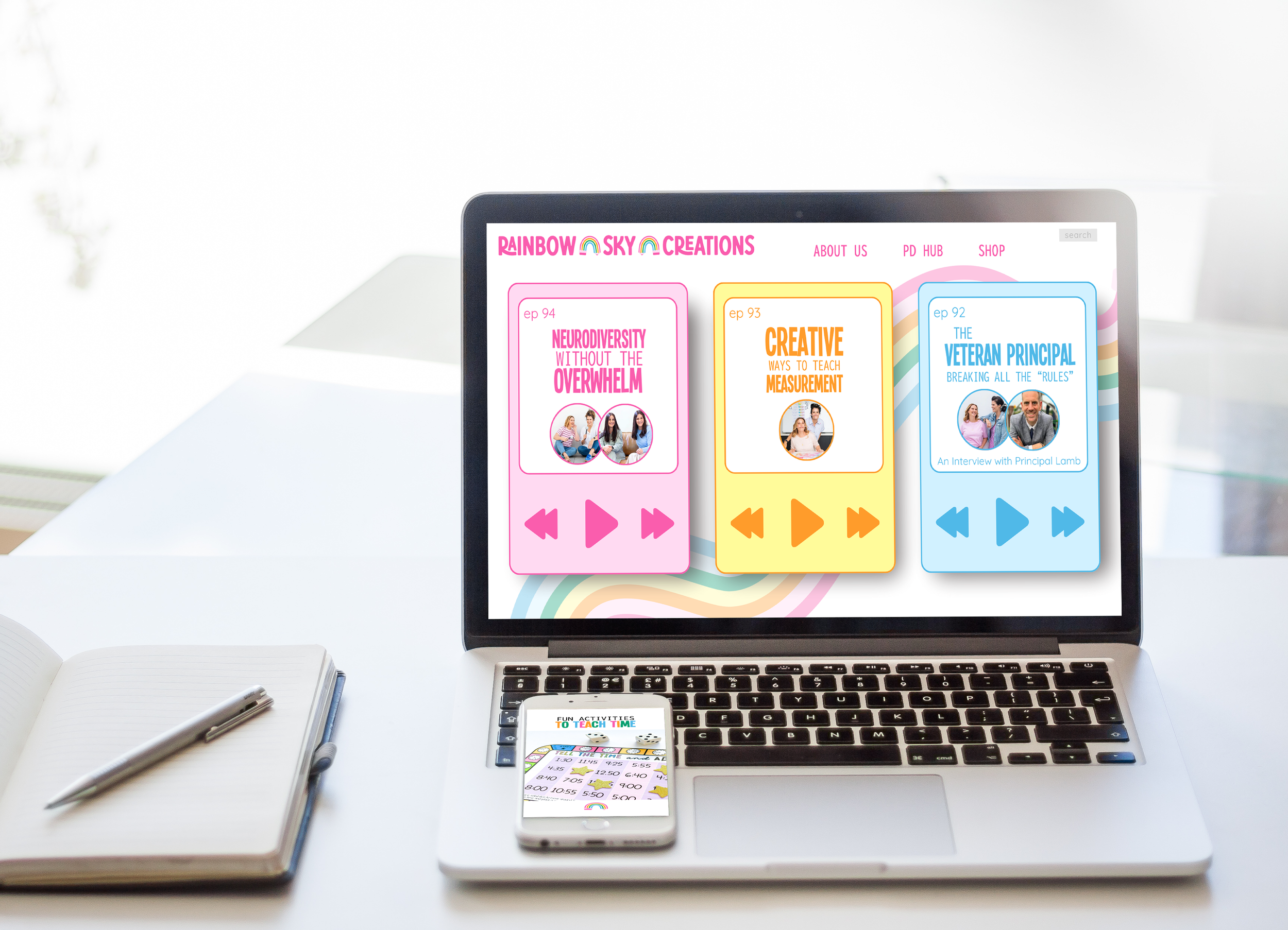
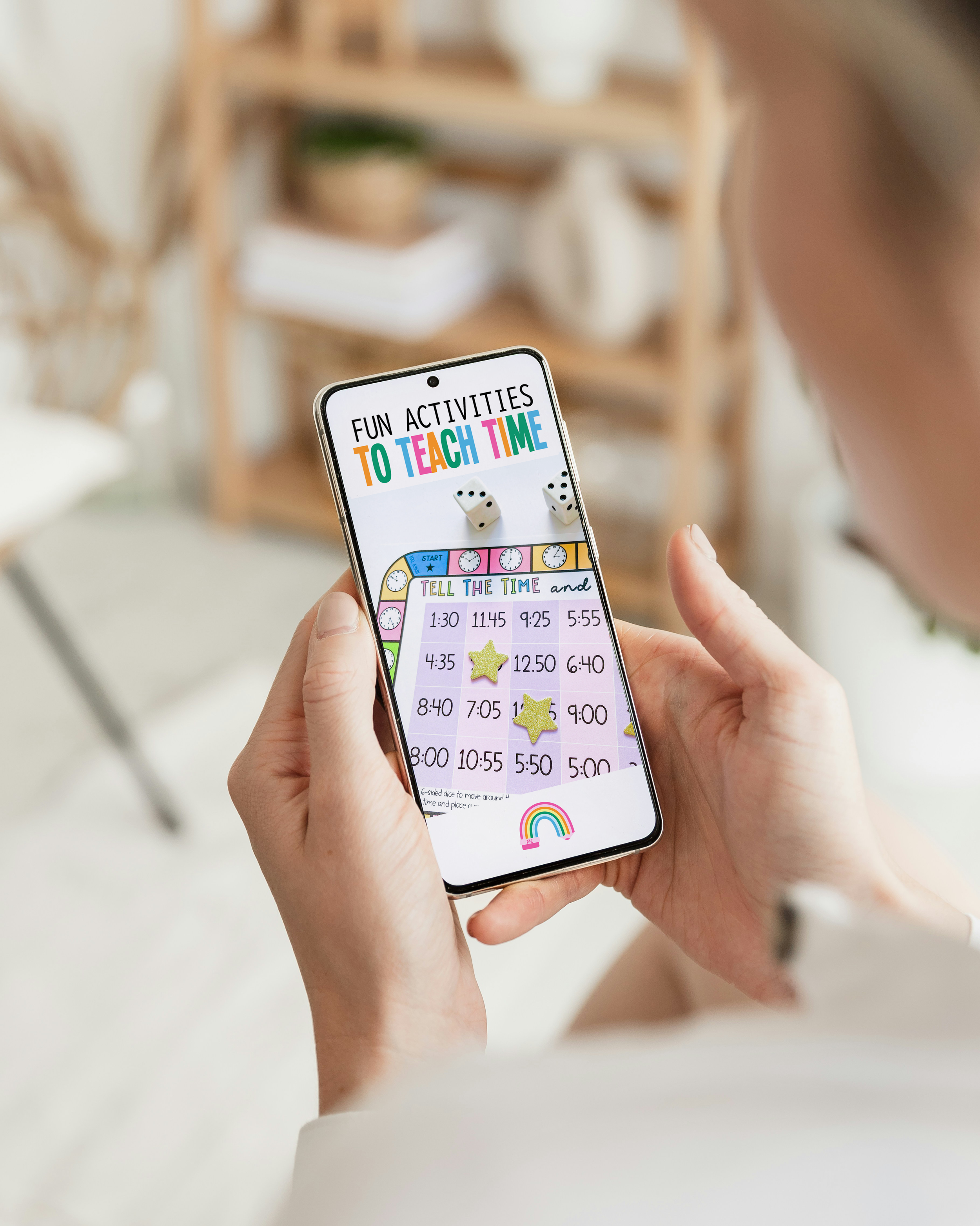
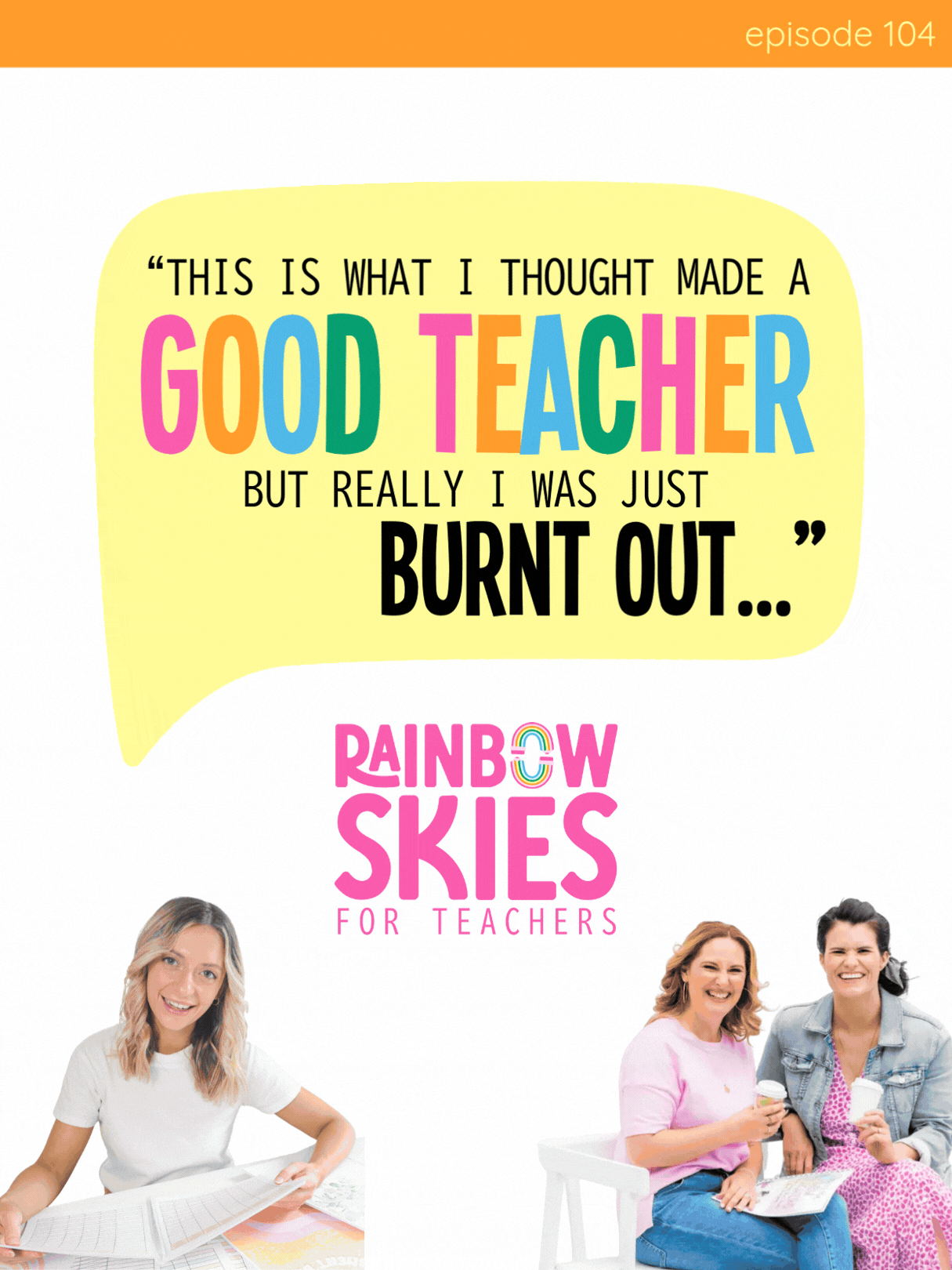
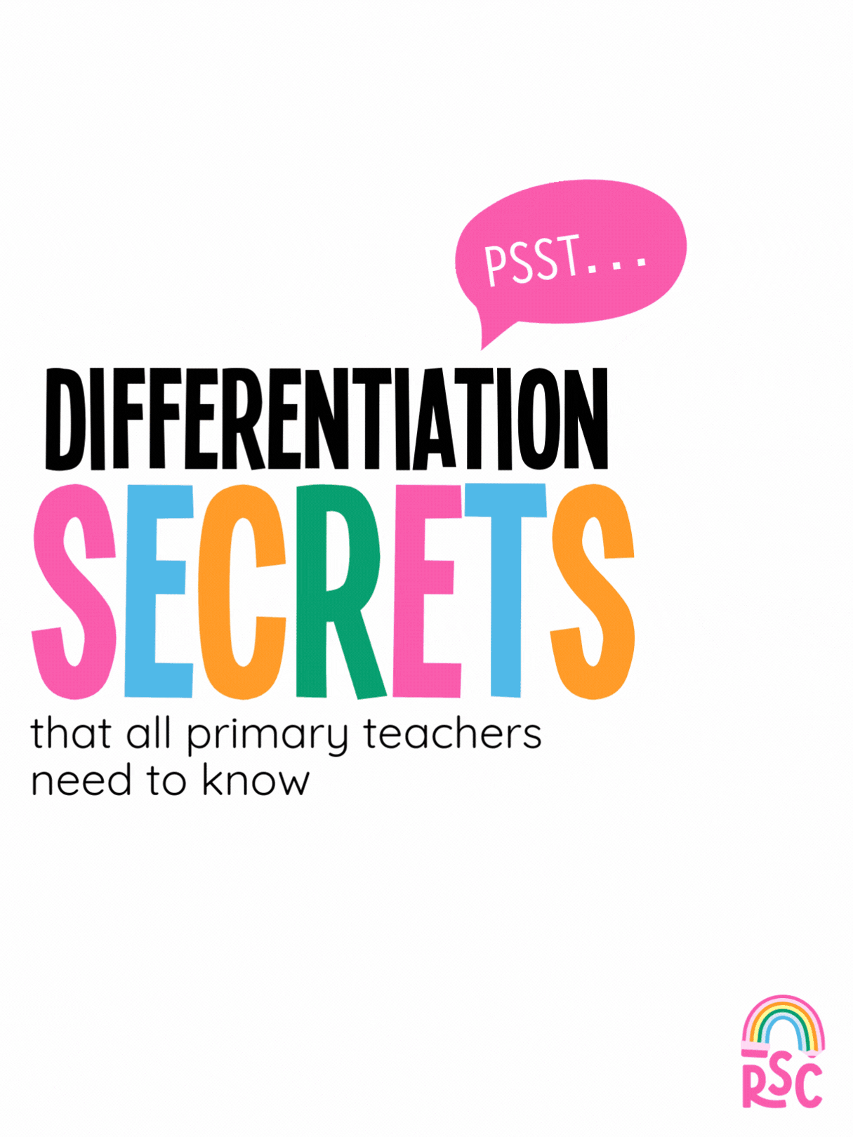
The vibe for Rainbow Sky Creations was built on the energy of real-life staffroom conversations, the kind filled with sticky notes, quick tips, and the shared coffee moments that keep teachers going. We steered away from the "copy-cat" teacher aesthetic and instead leaned into a bold, capitalised sans-serif typography that brings authority, clarity and that bit of ‘fun’ to their brand.
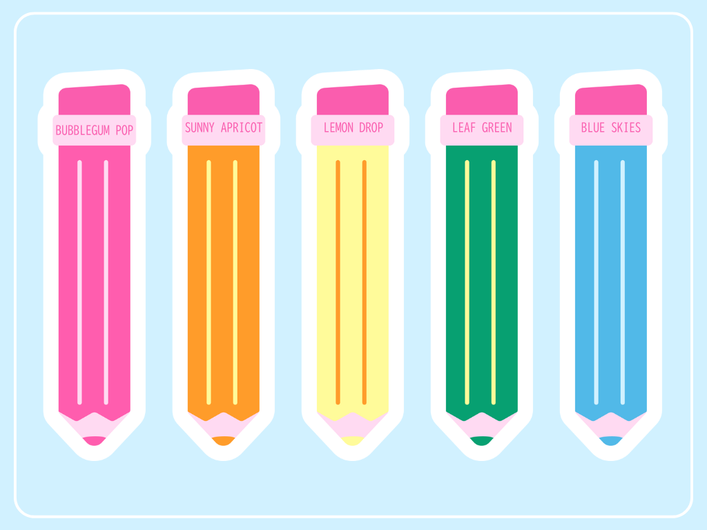
the palette
To keep it approachable, we balanced that strength with rounded edges, wavy pencil lines, and a "sticker-style" graphic suite. By mixing playful elements like custom Uno-inspired cards and speech bubbles with a bright, joyful palette, the brand now feels like chatting to that one trusted friend in the staffroom, the one who is ahead of the crowd but always has time to help you out.
the brand breakdown
“Throughout the process, it was obvious that you knew our business. You knew our audience, our latest products, what we offer and our vibe. That shone through your work and it felt like you went the extra mile to make sure that the branding really told a story about us and our biz”
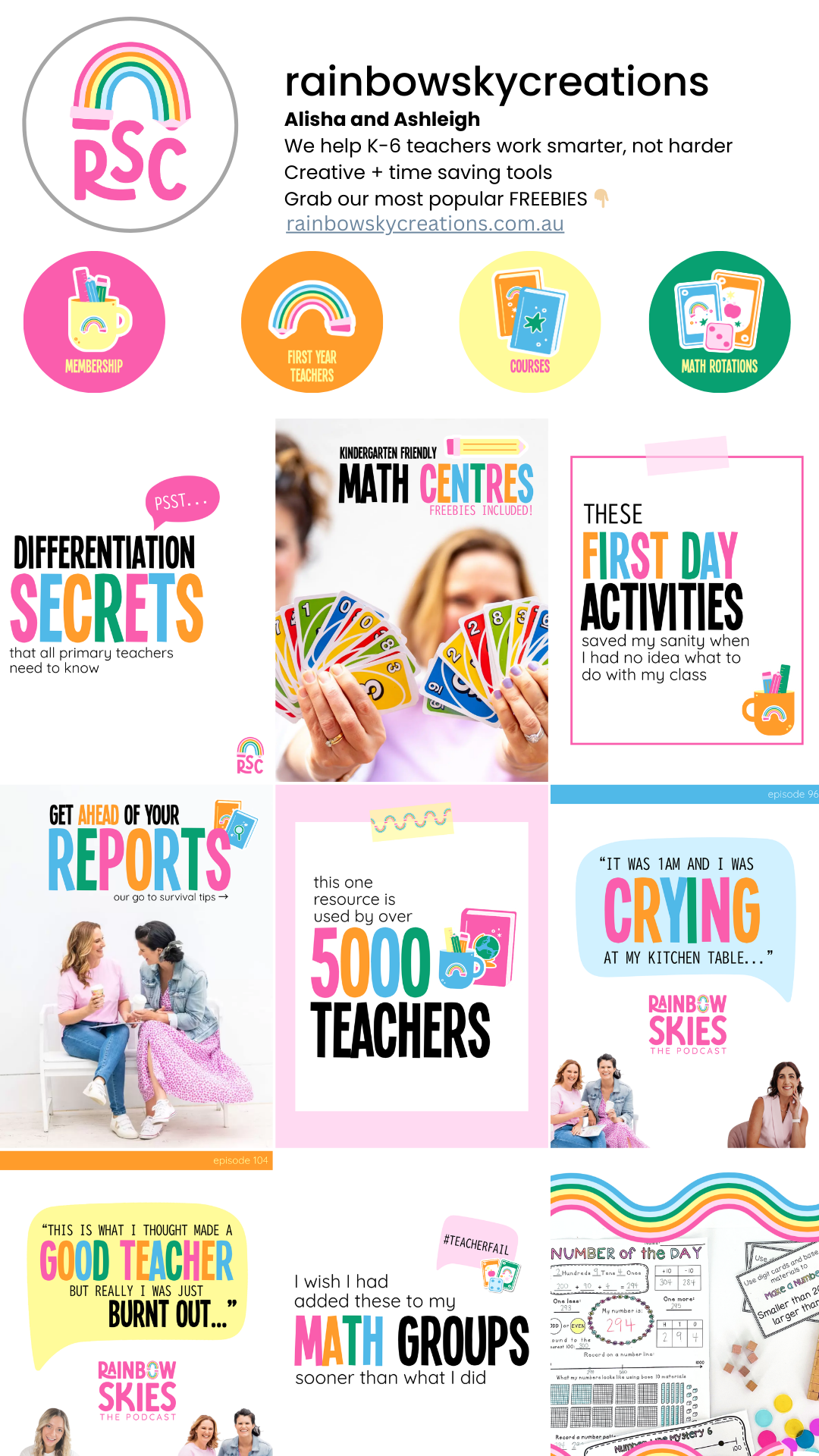
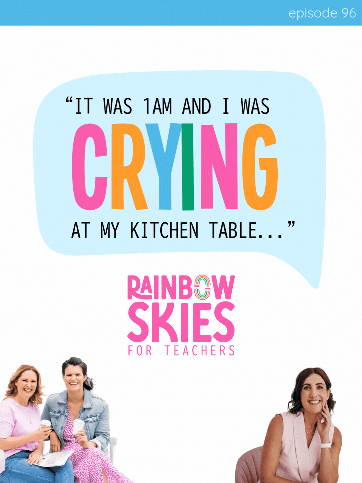
the socials
We transformed Rainbow Sky Creations from a brand that was "making do" with an old logo into a modern, iconic powerhouse in the education space. By creating a flexible suite of logos, including their iconic "yin and yang" rainbow pencil graphic, Ash and Alisha now have a visual system they can roll out across social media, digital resources, and their website with total confidence.