the
the backstory
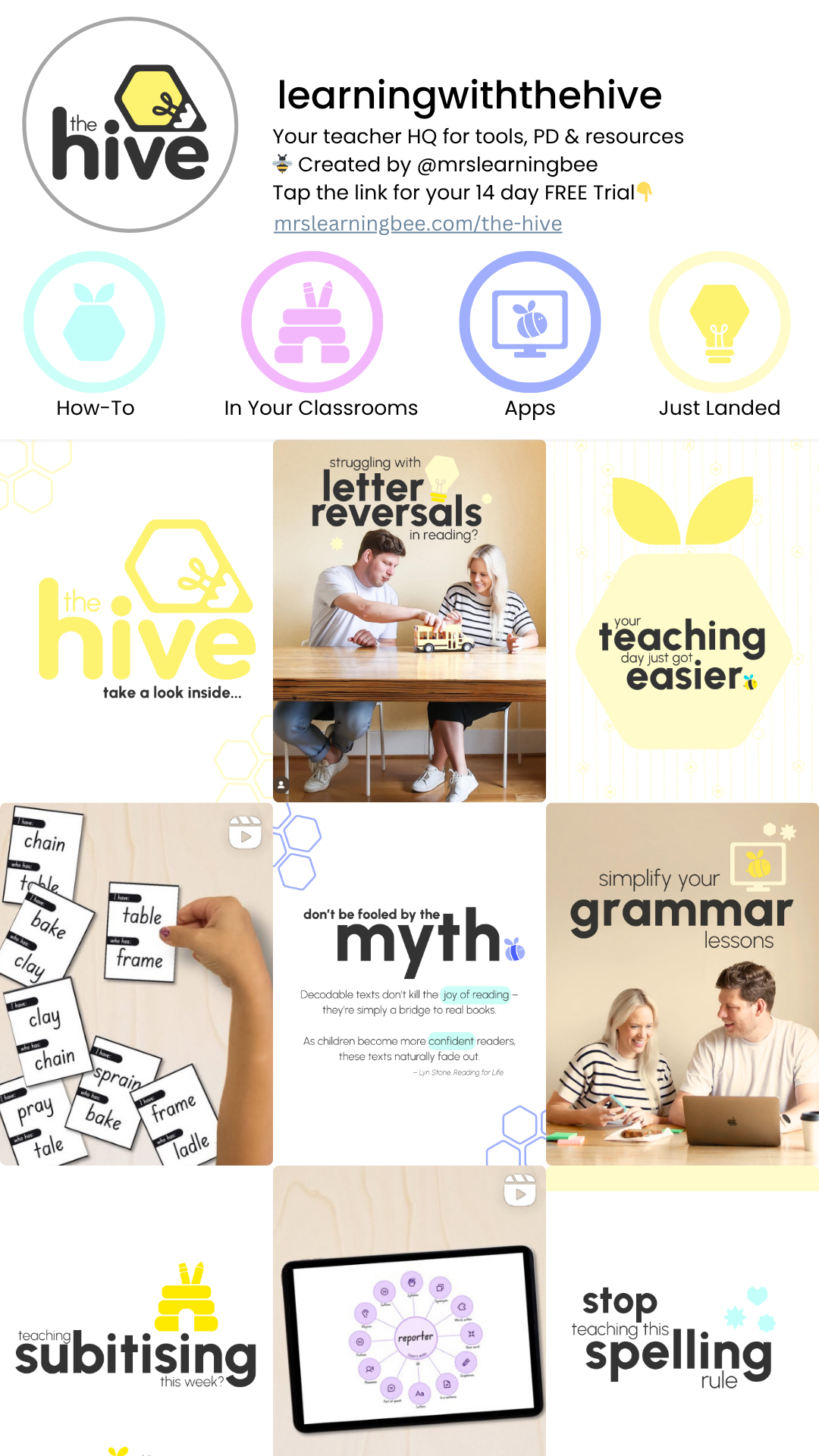
hive
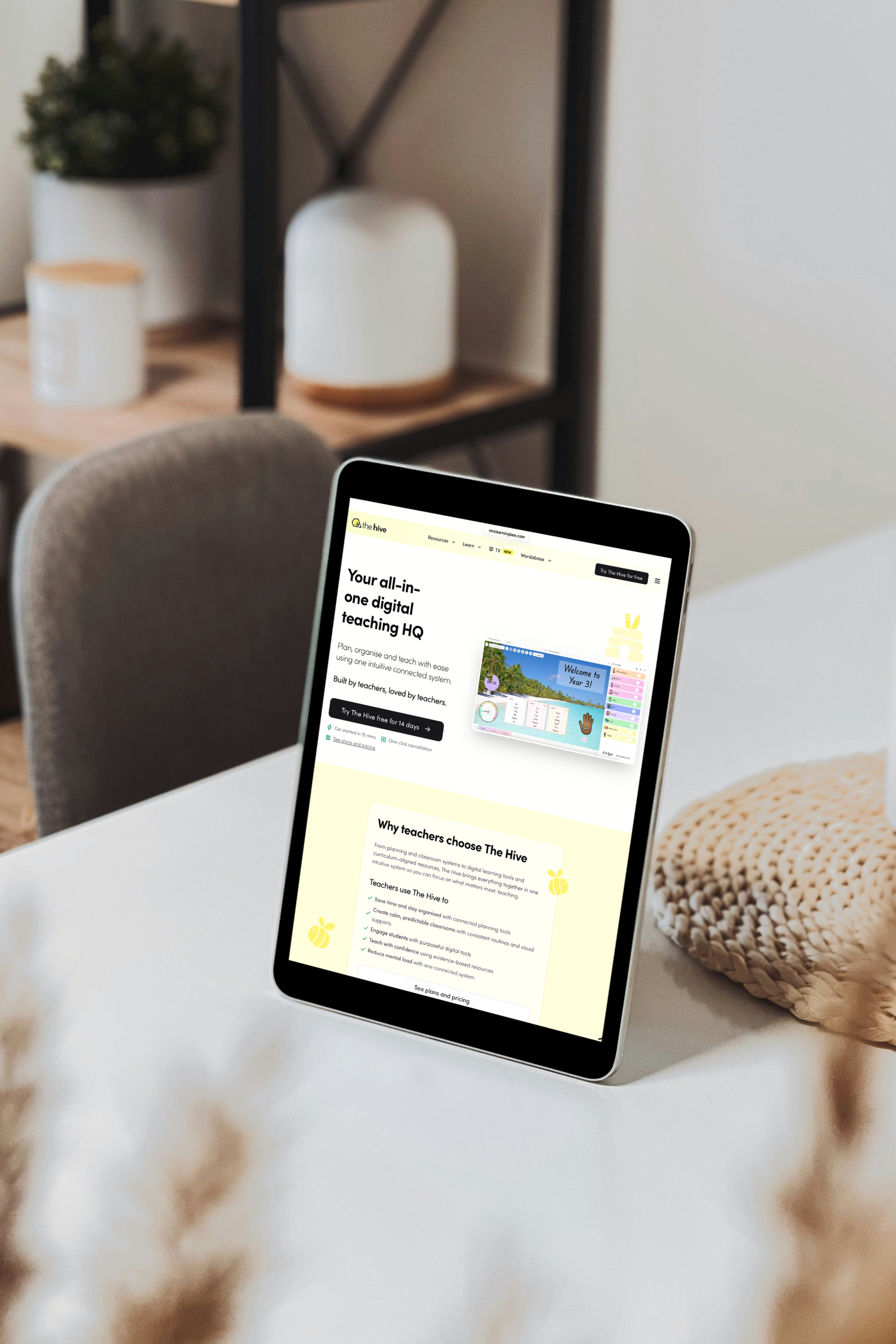
Tam and Jez reached out at a major turning point. Mrs Learning Bee was already a trusted name in the education space for evidence-based resources, and they had expanded by launching The Hive, a comprehensive digital teaching platform designed to simplify every part of a teacher’s day.
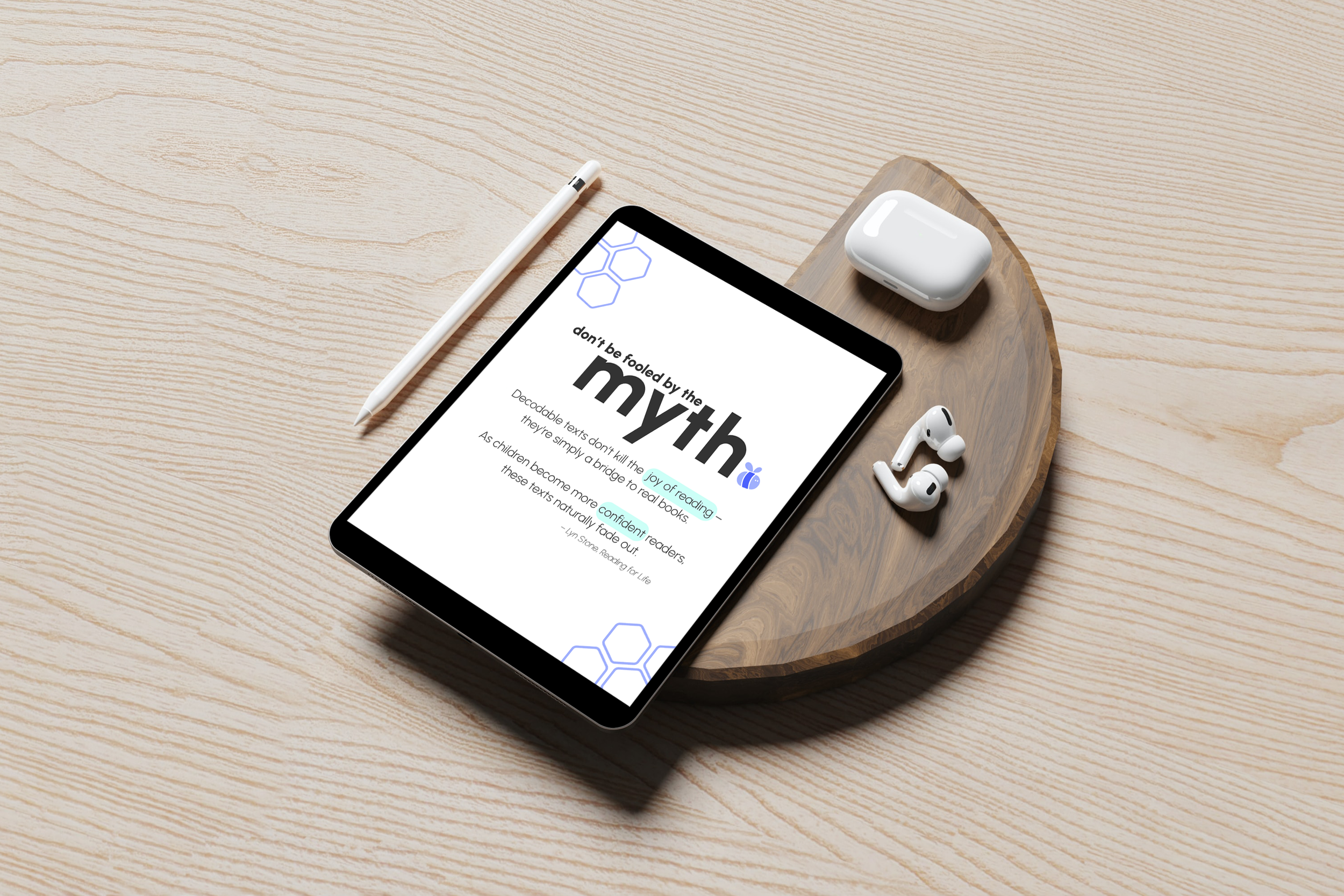
While the platform was already live, the visuals for both brands hadn't quite caught up to the level of innovation they were providing. They were ready to move away from a "cutesy teacher" aesthetic and transition into a visual identity that felt more polished and professional. We worked together to refine the foundational Mrs Learning Bee brand first, ensuring that both sister brands felt cohesive and ready to support their rapidly growing community of teachers.
the logos
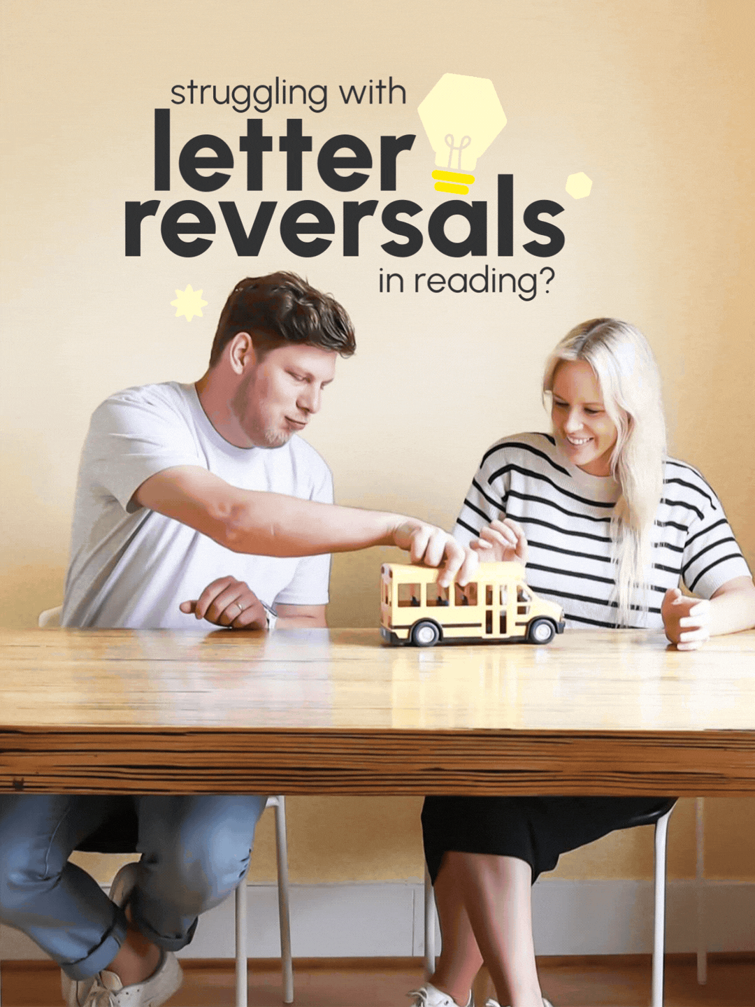
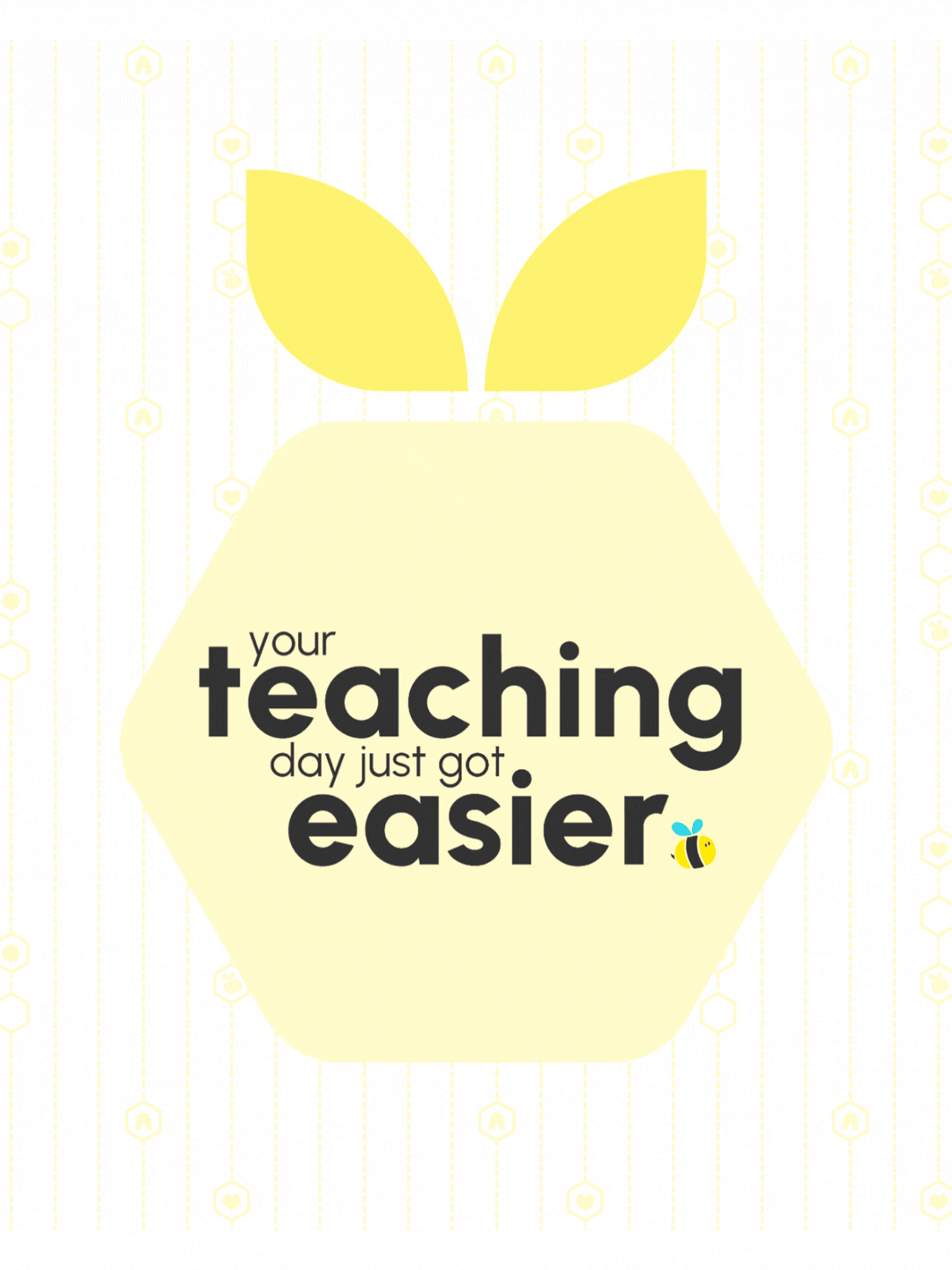
To make the brand uniquely theirs, we took those hexagonal inspired shapes and turned them into classroom elements, like the pencil pots, pins, and magnifying glasses, to create a visual language that ties the whole ecosystem together. It’s a custom look that’s instantly recognisable and sets them apart as leaders in the educational space.
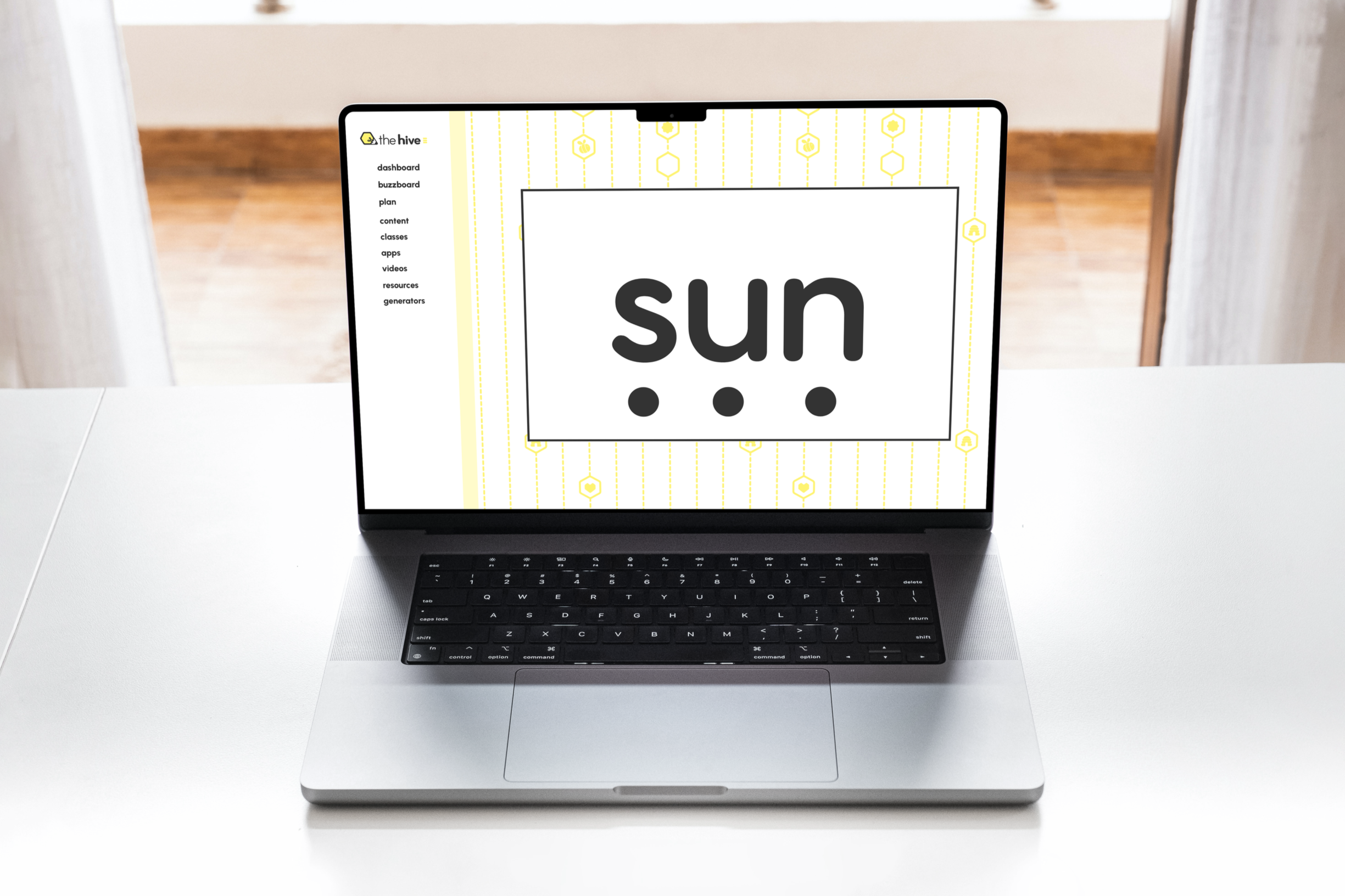
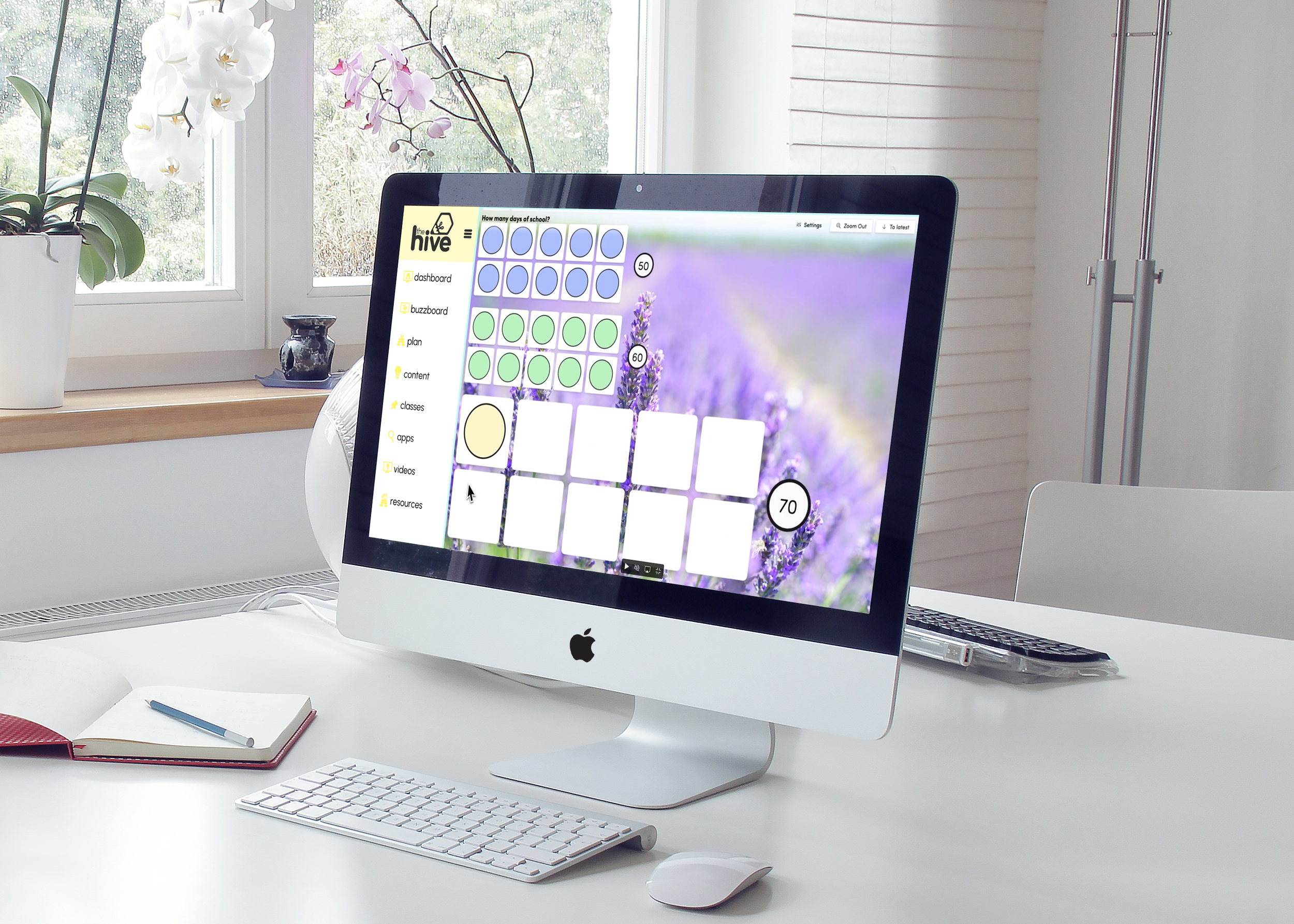
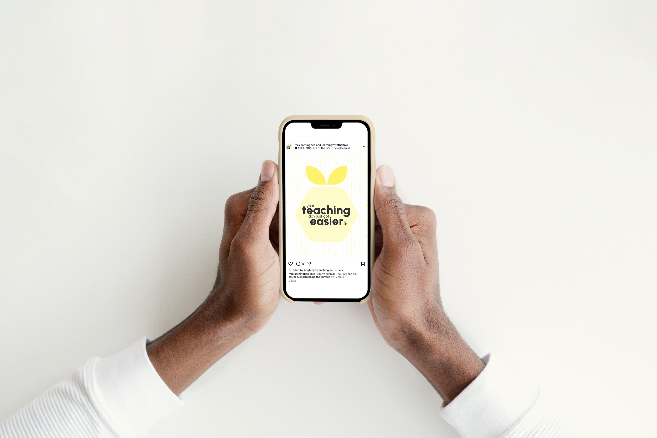
The direction for The Hive was about creating a bridge between high-level expertise and a clean, modern identity. We used geometric shapes as a strategic foundation, expanding on the hexagonal "Hive" theme to bring structure to the entire platform.
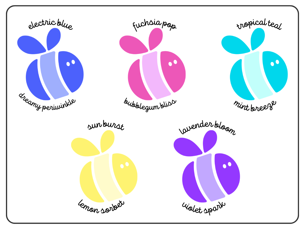
the palette
the brand breakdown
“We are so grateful for the way that you have kept the essence of our brand, but really elevated it to the next level.”
the socials
The result is a visual identity that allows both sides of the business to sit side-by-side with total clarity. Rather than just a quick aesthetic update, Tam and Jez now have a complete brand suite that matches the quality of the platform they have built, giving them the confidence to keep leading the way in their space.